
Since early June the S&P 500 has rallied nearly 8% making it seem like stocks might have bottomed, and may now be headed towards new highs. If you only looked at the Dow Index, S&P 500, or NASDAQ, then you might be lulled into a false sense of confidence. With equities (stocks) going up globally lately, how can we tell if it is okay to dive back into the market, or if we should be more cautious? In this article we will explore a few helpful indicators, which will make your investment decisions more informed.
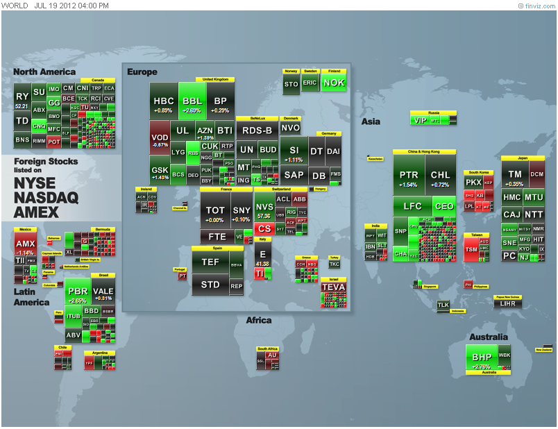 Financial Vizualizations is a great resource tool for a quick look at equities markets. Whether stocks moved up, indicated by green, or down, indicated by red, a glance at that website will give you the story of the day. The default is for a daily view, though if your investments tend more towards long term, then viewing the year-to-date or monthly Data may be a better choice. The World Market view only shows foreign companies shares listed on U.S. Stock Exchanges, usually called ADRs (American Depository Receipts), though sometimes called ADS (American Depository Shares). Over the last few years, global markets have often moved in step, with around a 90% correlation between major market moves. Each day markets open first in Japan, Australia, and parts of Asia, then later in the day in Europe. When the markets open in New York, most European markets are still active. There is also after hours trading in nearly all these markets, but the lower volumes mean that less change will be noticeable. Sometimes a down day in New York markets can lead to a down day in Asian markets a few hours later. Always check the longer term data, which can be more useful for trend spotting than the daily view data.
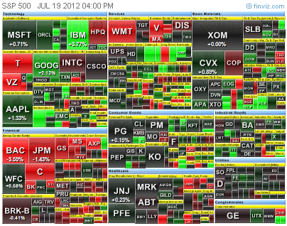 There is also an S&P 500 grid view, split up by sector, so you can see whether one sector drove the markets more than another. Once you are on FinViz.com, you can zoom in to individual areas to easily view specific companies share performance. Switching from day view, to month, year-to-date, or longer, can give you a better way to judge trends. When you notice one sector consistently moving more than another, then overall market moves tend to make more sense.
There are other reasons for the high correlation movements, though some of them are not really that intuitive. The largest institutional investors, comprised of sovereign wealth funds, large hedge funds, and global financial organizations, like the largest banks, comprise most of the daily trading volume in the major equities markets around the globe. The majority have trading desks that operate around the clock, sometimes only stopping from the Friday close of New York markets until the Monday morning opening of Asian markets. Besides movements of stocks, those large institutional investors are active in currency trading, known as Forex, and commodities trading.
Forex trading involves the buying and selling of currencies. It is essentially a range bound technical trading environment, often moving on news, though sometimes moved by large institutional investors. It is difficult to get accurate volume data without watching several dedicated trading platforms, though the platform I use gives an idea of major movement trends. Each day the largest movements are usually in the Euro (EUR) and U.S. Dollar pair, expressed as EUR/USD or more simply the exchange rate of those two currencies. This moves throughout the day, and is different than the rate a bank will give you when you walk in to exchange currency. The reason for the EUR/USD pair being the most heavily traded is that EUR are needed to buy European equities and European bonds, and USD are need to by U.S. listed equities, U.S. Treasuries, and to trade commodities futures, like crude oil. The U.S. is the largest issuer of debt, in the form of U.S. Treasuries, though closely followed by several European countries. In the United Kingdom, the Pound (GBP) is still in use, though oddly enough the GBP/USD is not the second most traded pair of currencies. That distinction goes to the Australian Dollar (AUD) on most days. The reason the AUD is so heavily traded is that it is a commodity play, due to the coal, iron ore, and natural gas export market there. An interesting more recent trend with the AUD/USD is that movement direction has a high correlation with the S&P 500. While the magnitude change can vary, the direction trend usually appears in the AUD/USD first. When you see the AUD/USD pair decline, you can usually expect the S&P 500 to decline, and the converse is also true for uptrends. Compare the 3 month AUD/USD with the S&P 500 to the 3 month EUR/USD with the S&P 500, then you can see how AUD/USD is a better leading indicator.
Some of the reason behind this correlation is due to what is known as the Carry Trade. There are several aspects to this, but the main idea is borrowing money in one country, then investing it in another. Sometimes the investment is through the bond markets, through the purchase of sovereign debt issued by a country. Among very large eligible institutional investors, the Discount Window is the mechanism of borrowing from the central bank of a country. You may see that referred to as the Prime Rate, or Primary Dealer Credit Facility in the United States. Obviously the average retail investor cannot make direct use of the Carry Trade, but it is responsible for much of the flow of funds around the globe. As retail investors, we are just along for the ride with the largest institutional investors, but through establishing an investment strategy, watching correlations, and sticking to our game plan, we can become more profitable in our investment decisions.

One of the more interesting indexes a self-driven investor can check at the end of each day, is the SPXA50R, or more simply the percentage of stocks listed on the S&P 500 that are above their 50 day moving average (50dma). There are also variations of this chart for the NYSE and NASDAQ, though with the S&P representing 500 companies, it is a better big picture viewpoint than other indexes. You can explore and compare those other similar indexes at StockCharts.com, including variations that use a 200 day moving average. The difference in using the 50dma over the 200dma is that the 200dma represents a longer trend, and it is easier to pick high and low points on the 50dma chart. While the market is moving down, it is tough to only use SPXA50R as a buying indicator, though usually if you are buying shares when this index is under 20, you are probably near a low point. Where this is more useful is knowing when to sell shares, and when to take profits. When you see SPXA50R go above 85, then you may want to check your investments, then decide if you want to take profits. Obviously individual company shares may not move exactly with this index, but it can provide a great market overview. The downside of this index is that you may find only once or twice a year when a market high or market low point is reached, and individual companies will not always match market moves. Use this in combination with your research, and company events, including earnings reports and major revenue change announcements.

10 Year Treasury Rate data by YCharts
As mentioned in the previous article, U.S. Treasuries are one of the most traded Safe Haveninvestments. This can also be one of our most useful indicators. While the Federal Reserve is still running Operation Twist, the yield has been pushed quite low on a historical basis. Despite that, the demand for Treasuries is still high. On 19 July 2012 the 10 year Treasury Inflation Protected Security, or TIPS, hit a record low yield of -0.627%. A simple idea behind TIPS is that there is a fixed payout rate, which is adjusted based upon the Consumer Price Index (CPI). So if the CPI indicates inflation, then the payout above the fixed rate increases. If the CPI indicates we are experiencing deflation, then the TIPS payment would decrease. When we see record low yields on any Treasuries, then we do not really have a sustainable market rally. Considering that TIPS are not part of the Fed’s Operation Twist, this is an indication that safe haven investment demand is still very strong. Checking the yield on the 10 year Treasury can be one of the quickest and easiest ways to see if markets really are turning around, or if a rally in stock markets might be a shorter term trend. Until safe haven demand declines, stock markets could quickly and easily turn around and decline.
In recent Argus Market Watch reports, other indications lead us to believe that current market sentiment is negative, despite the gains since early June. Vickers Stock Research noted corporate insiders selling their shares 3.3 times more than they were purchasing company shares. Insider buying can be a better individual company indicator than insider selling, but when sentiment is negative and growing, it can be tough for a rally to become sustainable. Argus Market Watch also note a recent widening of corporate bonds yields compared to Treasury yields, though they do not expect an increase in the corporate default rate. Fitch Ratings noticed a similar trend in Europe, as bond issuance outpaced loans for large corporations. Fitch reported that bonds comprised 52% of funding in the first six months of 2012, compared to 29% in 2011, while noting that this ratio of bonds to loans has increased every year since 2008. One reason for this is the relative safe haven status of highly rated corporate bonds, compared to sovereign bonds and bank bonds, though banks deleveraging are another reason behind the low loan issuance numbers. Fitch Ratings, in another report, places the U.S. corporate default rate at 2.2% for June 2012. This compares to an average corporate loan recovery rate of 72% over the last 12 years.
Commercial Mortgage Backed Securities, or CMBS, trade much like bonds, and are covered under a separate criteria of corporate ratings. Fitch Ratings currently maintains a stable outlook for 83% of issued CMBS, with 9% considered distressed, and a negate outlook for just 7% of CMBS. The latest default rates are Multifamily: 11.64% (from 11.35% in May), Hotel: 11.22% (from 11.15%), Industrial: 9.93% (from 10.00%), Office: 8.58% (from 8.64%), and Retail: 7.67% (from 7.45%). A recent news item puts this in perspective. The Blackstone Group, one of the largest private hedge funds in the world, spent $300 million to purchase over 2000 foreclosed homes to place onto the rental market. This is a huge bet on a recovery in the housing market. The Blackstone Group is not the only financial company making such a move, though so far this is the largest single move into the rental housing market. Since the Blackstone Group has many diversified investments in major companies, the futures markets, commodities, and Forex, this move shows that even some of the largest investors want some diversification.
At a minimum, like any investor, we want to get a return that is greater than the rate of inflation. Ideally we want to gain much more than that, increasing the value of our investments. There will always be times of uncertainty, and there is nothing wrong with sitting, watching, and waiting. As individual investors, we have no pressure to make moves every day. We can choose when we want to buy or sell, and in which directions we want to invest. It is always a good idea to be flexible in our choices, with some funds set aside in Money Market, bond fund, or just as cash, to take advantage of buying opportunities. Hopefully with some of the indicators I pointed out in this article, we can also make more informed decisions of when to move into investments, and when to take profits.
Investing is never without risk, so readers are encouraged to do their own research, check many sources of information, and determine the path of their investments. We hope the information we provide will be a launching point for that research, and point you towards the path of being an informed and successful investor.
G. Moat