On the last day of July 2012, the most recent S&P / Case-Shiller Home Price Index data was released for May 2012. These Indices are calculated monthly using a three month moving average of data from 20 cities in the United States. There are further reports using 10 cities, and other reports for non-seasonal adjustments. Sometimes weather can be a factor in seasonal adjustments; as an example the recent mild winter across much of the U.S. likely contributed a disproportionate amount to increases. Though data recording for this began in the 1980s, based mostly upon repeated sales and behavioral finance, historical data was used to create an index as far back as the 1890s. In each sales transaction recorded, a search is conducted to find information on any previous sale. So this index does not look at new home sales data. San Diego is included in both the 10 city and 20 city index.
In this most recent report, we find that average home prices increased 2.2% from April 2012 to May 2012, for both the 10 and 20 city composites. Compared to May 2011, it was found that home prices declined 1.0% in the 10 city area, and 0.7% in the 20 city area. Spring and early Summer are historically stronger buying months, so keep that in mind with this two month improvement in data. The peak in all historical data was August 2006, and many of the cities in this index are still far below that level, with hard hit areas Phoenix over 50% below peak, and Las Vegas over 60% below peak. San Diego saw a 1.1% monthly improvement from April to May 2012, though average home selling prices are still 1.1% below the year ago period.
The housing market appears to be stabilizing, though we will need to see similar data over the next several months to confirm this possible trend. The third (Q3) and fourth (Q4) quarter of 2011 experienced a decline in average housing prices, while the early part of 2011 also indicated improvements similar to what we see in early 2012. While the hardest hit areas are showing improvement of supply and demand, the overall slowing economy could make continued improvement difficult to achieve. The number of underwater homes, representing negative equity or nearly that level, decreased to 28.5% of all residential loans in Q1 2012, compared to Q4 2011 levels of 30.1% underwater.
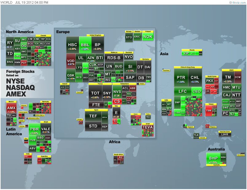
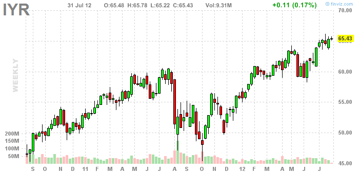 Since the Case-Shiller Home Price Index data is not released that often, investors may want to watch an interesting Electronically Traded Fund (ETF) offered through iShares, under the symbol IYR. This ETF attempts to replicate the performance of the Dow Jones U.S. Real Estate Index Fund, through holdings in companies involved in commercial and residential property. We can get an advance look into market trends by following this ETF, though the correlation of data to IYR is only near 65% accuracy over the last two years. Think of this more as a good short term trend indicator, rather than a longer term predictor. It’s important to follow developments in commercial real estate, since the amounts involved in most transactions are far greater than the residential housing market. While problems in the commercial real estate market are not necessarily a predictor of activity in the residential real estate market, a decline in that sector is likely to happen prior to a decline in residential markets. The main difference in the commercial market is that we are more likely to see work-outs of problem loans. Recently the Federal Housing Finance Agency rejected a request by the U.S. Treasury to write-down the principal of some underwater residential mortgages. The reason the FHFA stated for denying this move is they felt it would drive up the cost of a taxpayer bailout. Fannie Mae and Freddie Mac were seized by the U.S. Government after failing in 2008, mostly due to losses on sub-prime loans. Both Fannie and Freddie have received over $190 billion in funds to facilitate winding them down. The eventual hope is that the private sector will completely replace these government sponsored enterprises.
Housing was a much larger component of the overall economy prior to the recession. It is now less of an economic engine than in the past. In a way that may be better moving into the future, as the possibility of another housing bubble is far lower. That would mean more stable real estate markets without huge swings one way or the other. Consumer spending is responsible for about 70% of U.S. economic activity. Recently the savings rate increased to 4.4% even though household income increased 0.5% in June 2012, which suggests consumers are becoming more cautious and frugal. Without a significant improvement in the labor market, this trend may continue over the next several months. The increased savings is not a bad sign, though in a mostly credit driven economy, this activity is less likely to improve growth.
 As mentioned in a previous article, the movement of money through banks, often in the form of the Carry Trade, can be a predictor of economic change, or even a predictor of loan availability. This relates directly to business loans, investment activity, commodity futures markets, commercial real estate, and housing. The Financial Times went through a great explanation of our current global banking environment recently (link to article in image). The main idea is that banks can predict the time value of money, in that loans are may to predict the need for funding of future goods and services. Under a conventional idea, as long as a population is growing, we can reasonably expect that demand for future goods show grow at least at the same pace. So inflation under this model would grow as population increases, under the assumption that money will become more available than goods and services. Banks have been able to lend based upon future scarcity of goods and services based upon their credit worthiness, mostly a reflection of their base capital holdings. Those who have read about upcoming Basel III rules and higher capital requirements for large banks may find more detail of interest, though for now I will save that for a future article. Until the establishment of Central Banks in many countries, banks operated under this model, and fared well unless they put forward too many bad loans, or in other words, over-predicted future economic activity. Heading into 2008 and the crash of housing markets and loan facilities, it appeared that banks had vastly over-estimated future economic growth. This left them far short of money, leaving many banks with too low of capital to initiate new lending activity. Asset write-downs and bankruptcies were inevitable, as we saw in late 2008 and early 2009. The Federal Reserve, as the Central Bank of the United States, saw this sudden change and initiated extremely low lending rates to large banks and financial companies. Partially this was in the hope of future banking activity improvement, because a central bank still functions much like the conventional banking model. If 2008 and 2009 had been a liquidity issue for banks, which caused the decline in lending, then we would have seen a faster recovery. While 2010 was a great improvement in the economy, it appears much of that was due to enhanced productivity, since lending activity remained constrained. When economic activity declined in 2008 and 2009, there were many inventory declines. Under the curtailed lending environment, corporations began to stock-pile money to use for future activity, mainly bypassing banks in the process. Corporations began to run more of their own lending and financial activity, often in the form of greater corporate bond issuance.
Fast forward to 1 August 2012, and Ben Bernanke of the Federal Reserve released newFederal Open Markets Committee meeting minutes. Lending rates to major banks and financial institutions are still held at 0.0% to 0.25% and expected to be this low through late 2014. The Fed notes that U.S. economic activity has somewhat slowed in the first half of 2012. Expectations are for moderate growth through the rest of this year. In the previous FOMC meeting, the Fed stated that they were prepared to “take further action”, while in this latest meeting, they stated: “The Committee will closely monitor incoming information on economic and financial developments and will provide additional accommodation as needed to promote a stronger economic recovery and sustained improvement in labor market conditions in a context of price stability.” Since the stock market was expecting more stimulus in the form of another round of Quantitative Easing (QE), when more QE was not announced, stock markets quickly started to sell off, and the U.S. Dollar Index climbed. Those who have followed the Australian Dollar (AUD) movements against U.S. Dollar (USD) movements, as mentioned in the previous article, would have seen the drop happen first in AUD/USD. Just to add to the turmoil on the day, Knight Capital Group, one of numerous Market Makers for equities markets, experienced a computer algorithm malfunction that caused volumes to increase suddenly and excessively in shares of 148 different NYSE listed companies. While Knight Capital Group did quickly correct this action, and erroneous trades are likely to be unwound, this morning trading issue placed the market on edge for the afternoon FOMC announcement.
It appears at the moment that the equities markets were expecting more stimulus. The recent increase began just over a week ago when European Central Bank President Mario Draghi stated that the ECB would use any and all means to shore up the Euro, and assist troubled economies in Europe. It was a bold statement, and global markets rallied on the hope of future monetary expansion. My feeling is that we will see this unwind further as the ECB meets with various finance ministers in Europe, and policy change proposals quickly run into a wall of bureaucracy. On 2 August 2012 the ECB will meet to work out details of Draghi’s proposals. At the heart of this is the idea of the ECB buying bonds directly from troubled economies, like Spain and Italy. This is similar to the Federal Reserve’s Operation Twist, which I discussed in a previous article. This idea was attempted with Greece, though when Greece partially defaulted, the ECB was unwilling to write-down those bond purchases, and the action unwound in the markets as other financial institutions felt they were being treated unfairly. This further constrained lending and credit markets in Europe, though large global banks headquartered in Europe did not shift activity to lending in U.S. markets. Part of the reason again was the constrained capital levels, and requirements by governments to increase capital levels. The idea of increased capital is that banks and financial companies would better be able to handle economic shocks.
 There have been some areas of improvement. New housing activity in the United States has risen slightly in the early part of 2012, though more recent activity is sharply lower. As mentioned above, favorable weather was one factor. Existing homes still account for nearly 90% of housing market activity, though new home sales accounts for building materials and construction worker activity. As we move towards a more favorable historical time for existing housing sales, the slowdown in new home sales indicates we might expectslower economic recovery heading towards the end of 2012. Housing research from RealtyTrac indicates that foreclosure activity increased in early 2012, compared to late 2011, in 125 U.S. metropolitan areas. Recently bankrupt Stockton, California posted the greatest foreclosure rate at 2.66% with 6218 units facing foreclosure. The greatest increase in foreclosure activity has been seen in Atlanta, with 46,267 units in foreclosure. Some areas did decrease foreclosure activity, with San Diego posting 11% fewer foreclosures than the year ago period. To add some context to this information, the 30 year mortgage rate reached a record low of 3.49% in late June 2012.
At the moment it appears that despite record low mortgage rates, traditional bank mortgage lending is still constrained due to macro-economic factors, deleveraging, and increased capital requirements. While equities markets expected more stimulus in the form of further Quantitative Easing, our take-away is that the perceived need for QE and other stimulative measures, is that the current economy is not quite strong enough to stand on it’s own. Real economic growth appears negative once we remove the influence of previous economic stimulus. Corporations have been using other forms of funding as banks constrain lending, and we may see similar moves amongst smaller companies, and perhaps even in the housing market. While all these factors may suggest we have hit a low in housing markets, caution is advised moving forwards. We will need to continue to watch economic activity indicators, labor markets, and potential action by Central Banks heading to the end of 2012.
G. Moat